Iterative Design and User Testing: 412 Food Rescue
Context
This project was made for CSCI 1300: User Interfaces and User
Experiences, a class at Brown University taught by
Jeff Huang. Our
goal was to choose a startup and based off of only a short summary of
the goals of the startup, we had to design an interface and perform
user testing.
412 Food Rescue
We were inspired to design a mobile app for 412 Food Rescue, a
start-up that instantaneously redistributes surplus food from
retailers to food banks. Instead of making a website, we chose to
create a mobile app because it would make it easier for restaurants to
take photos of leftover food and for volunteers to navigate while
driving.
We started brainstorming our ideas for the design based off of a blurb
in an article that was written about the startup on Carnegie Mellon
University’s website:
“Co-founded by Leah Lizarondo, 412 Food Rescue partners with food
retailers and other suppliers to pick up their healthy surplus food
and deliver it to community nonprofit organizations, where it is
directed to individuals and families experiencing food insecurity.”
Pre-Design Questions
Before starting the design process, we considered how our app might
affect various groups of people and addressed the following questions.
Who is directly affected by the interface?
People directly impacted include the restaurants and organizations
that want to donate leftover food, the volunteers, the people who
receive food from food banks, and the people working at the food
banks.
Who is indirectly affected by the interface?
People indirectly impacted are garbage collectors who might be laid
off due to less need to pick up trash. Another group is restaurant
customers because they are encouraged to visit stores that advertise
itself as zero waste with 412 Food Rescue rather than non-green
stores.
How are these mentioned groups affected by the interface?
Restaurants can now efficiently distribute food to shelters through
volunteers and reduce waste. However, food banks will have an influx
of donations, which might negatively affect the workflow of employees
there. Nevertheless, the increase in food can improve the quality of
life for those who face food insecurity.
What are the ethical concerns?
The emphasis on immediate delivery neglects the negative consequences
of transportation’s gas emissions. It is difficult to balance
eco-friendly transportation while maintaining the quality of the food
(volunteers can choose to ride scooters but that might cause bruises
in food).
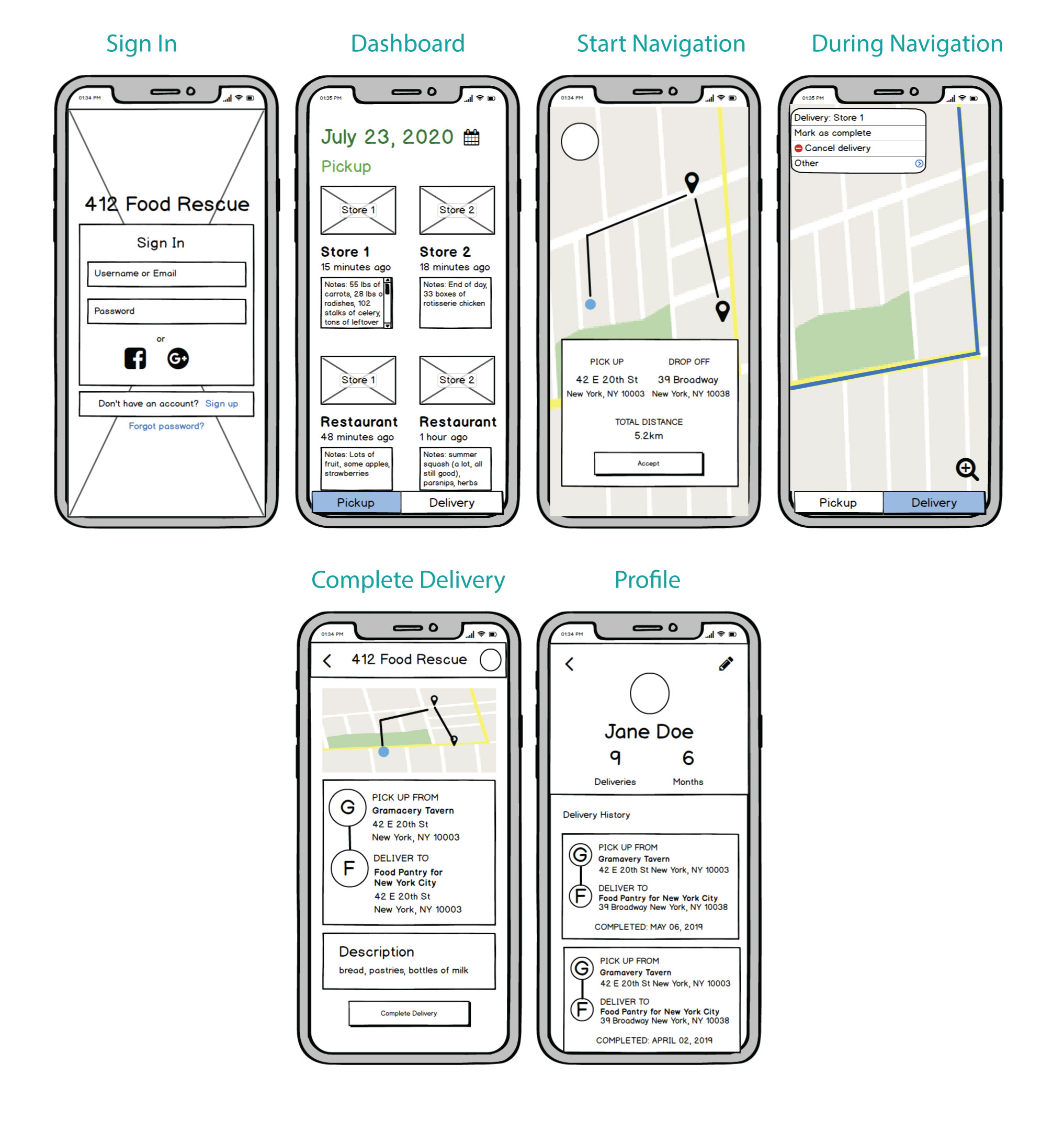
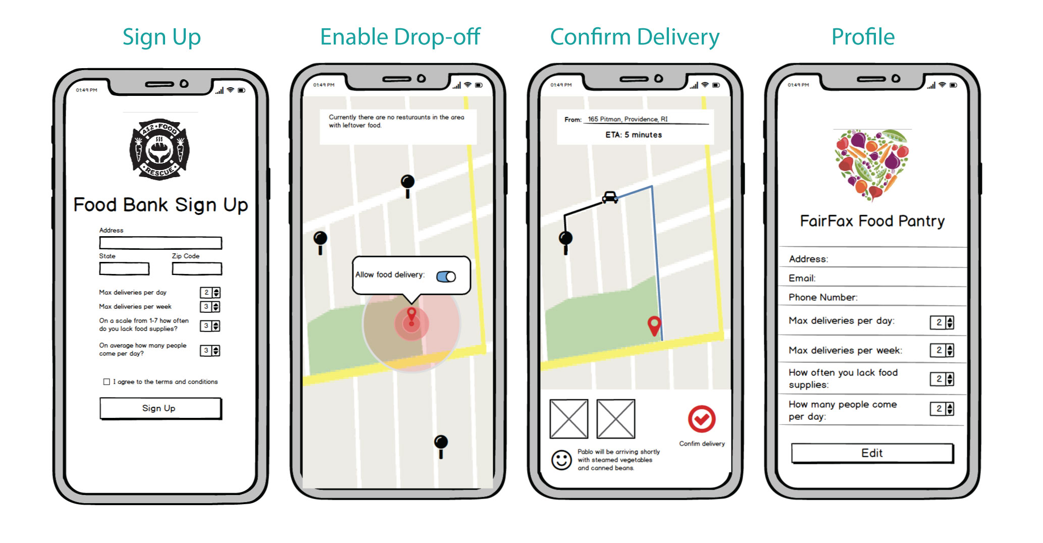
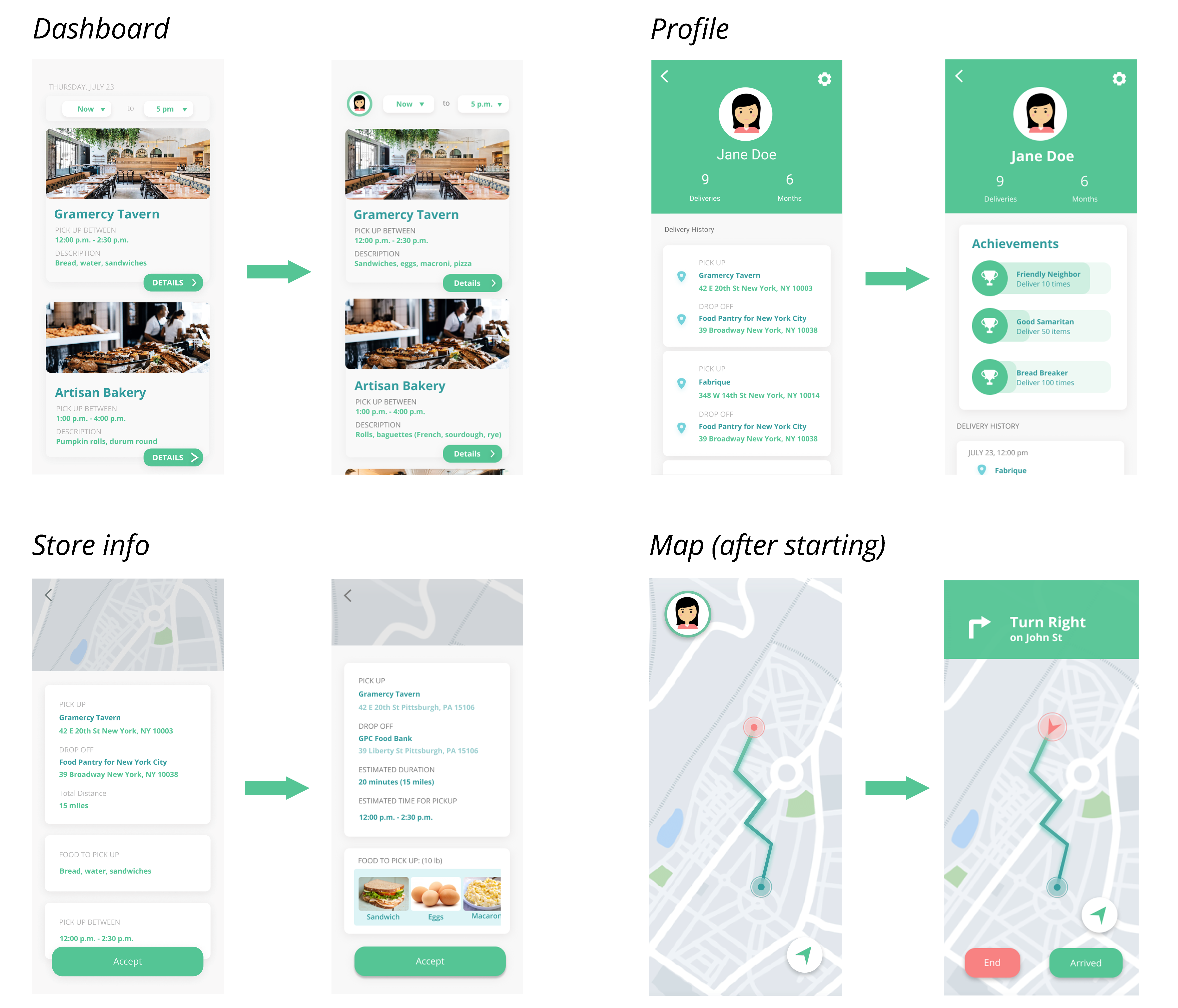
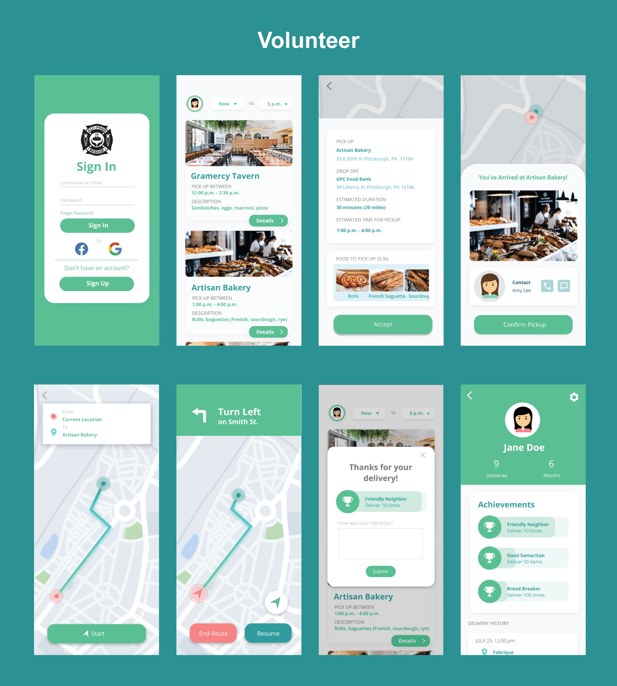
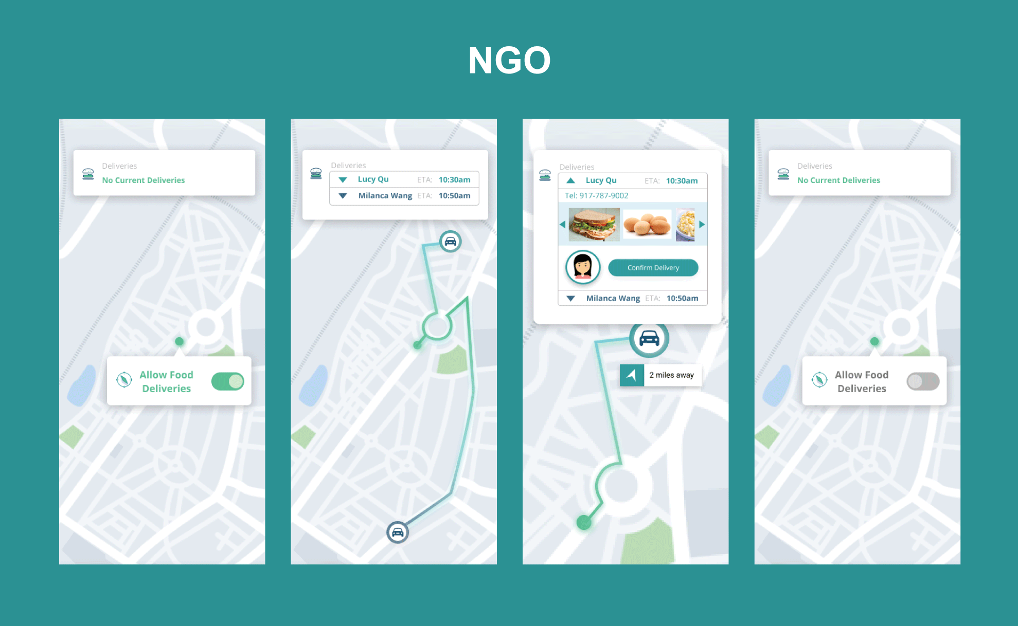
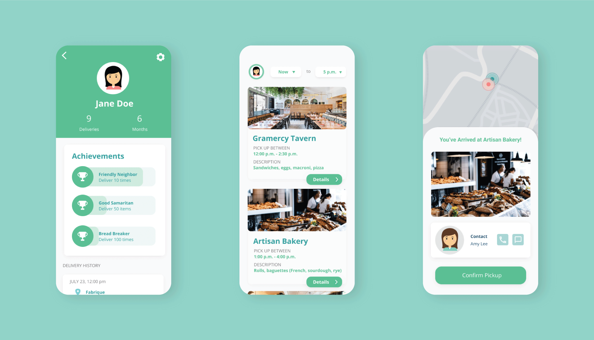
User Flow and Low Fidelity Wireframes
To begin, we mapped out the user journey of three groups of people -
food retailers, volunteers, food banks - and integrated the flow in
our wireframes.
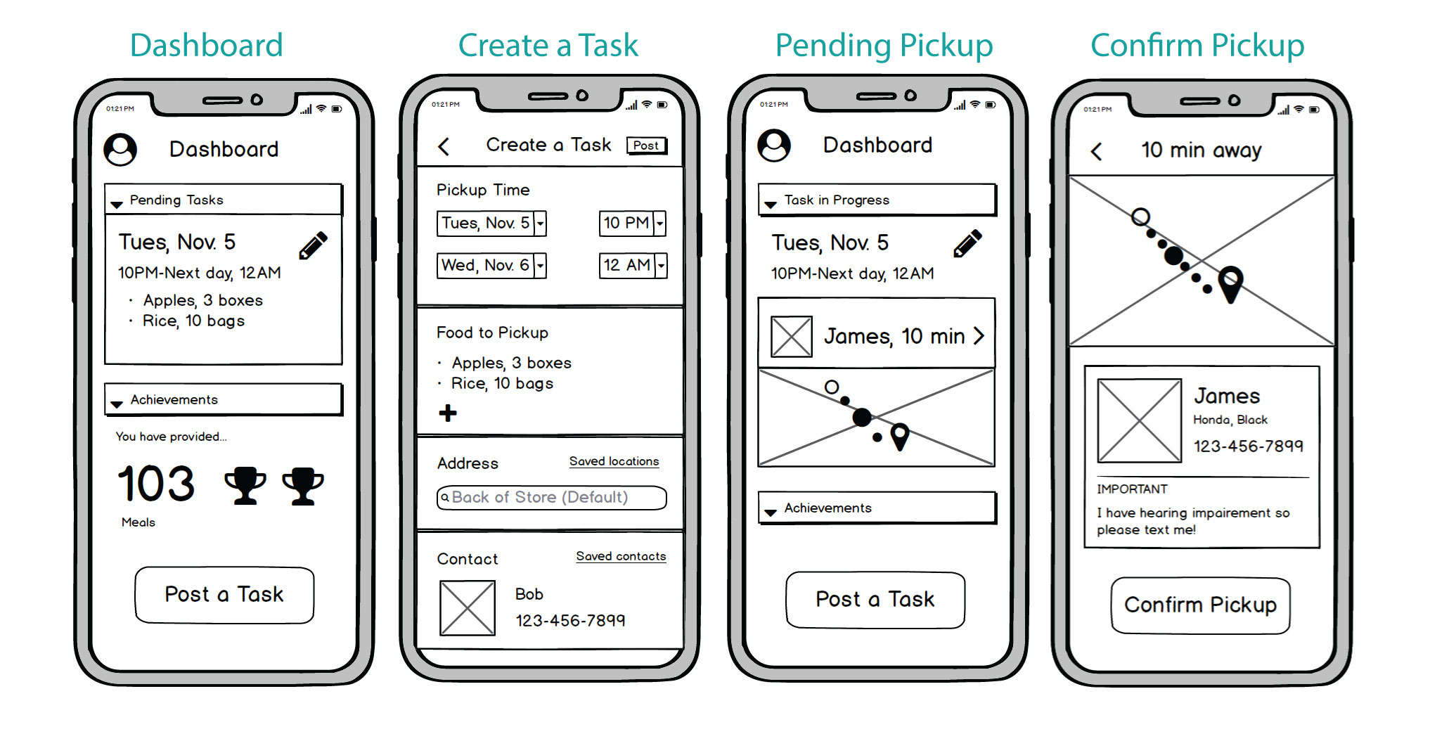
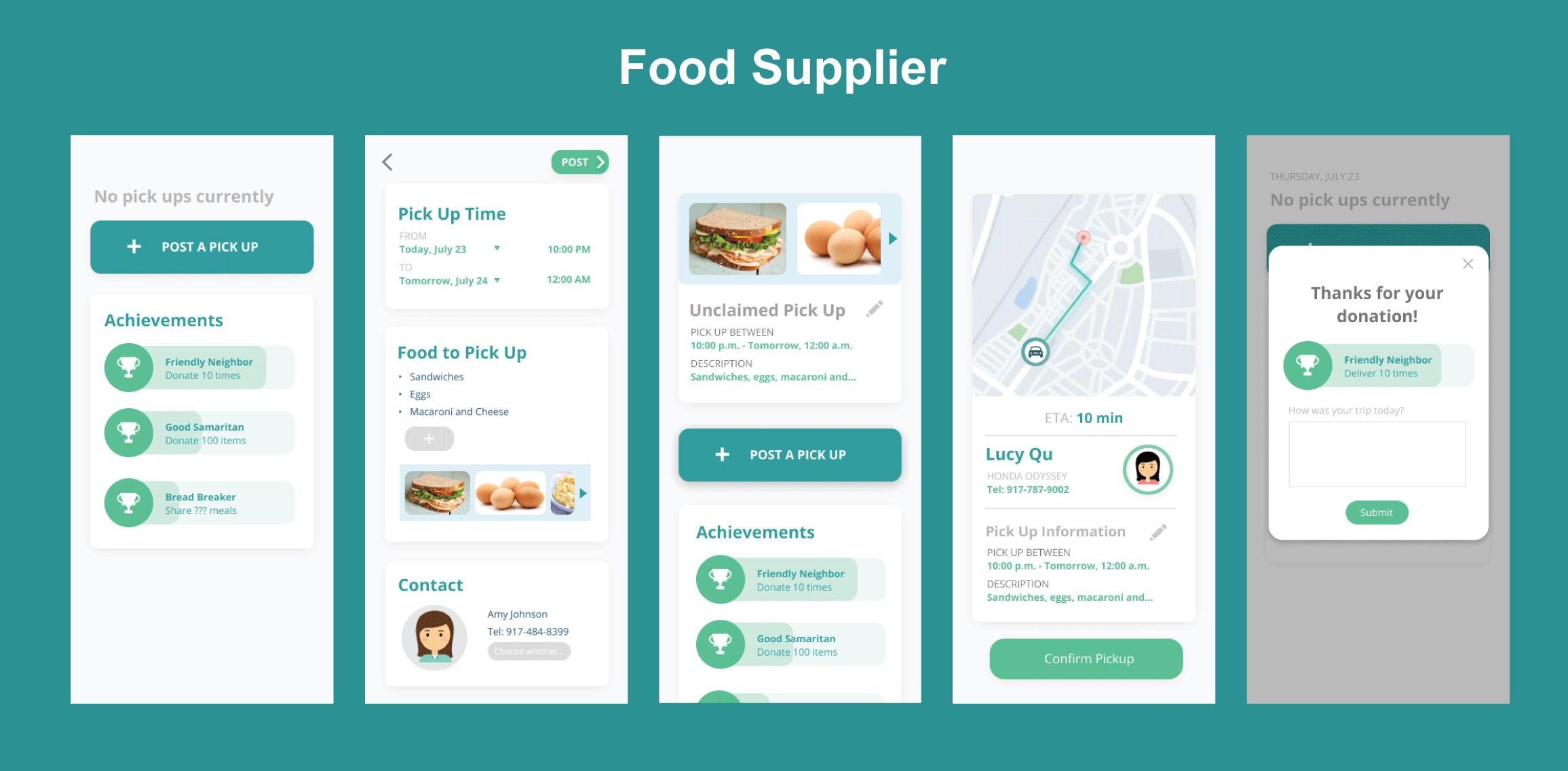
Food Providers
Food retailers will post their leftover food on the app, and be
notified when a volunteer picks it up. After the volunteer picks up
the food, retailers confirm the pickup.