Iterative Design & User Testing: 412 Food Rescue
Role: UX Designer · Course: CSCI 1300, Brown University
Team: Miranda Mo, Jennifer He, Milanca Wang
Context
We chose 412 Food Rescue, a startup focused on redistributing surplus food from retailers to food banks and community organizations. Our goal was to design a mobile app experience that streamlines the process — from food pickup scheduling to delivery coordination.
We chose mobile over web because it makes it easier to photograph surplus food, navigate while driving, and coordinate logistics in real time.
Pre-Design Questions
- Who is directly affected? Food providers (grocery stores, restaurants), volunteers, food banks/NGOs.
- Who is indirectly affected? Recipients of redistributed food, local communities.
- Ethical considerations: gas emissions from delivery routes, volunteer safety, data privacy of food providers.
- How do we make the app accessible to volunteers with varying tech literacy?
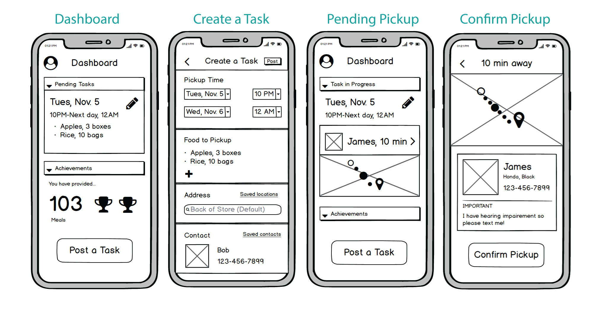
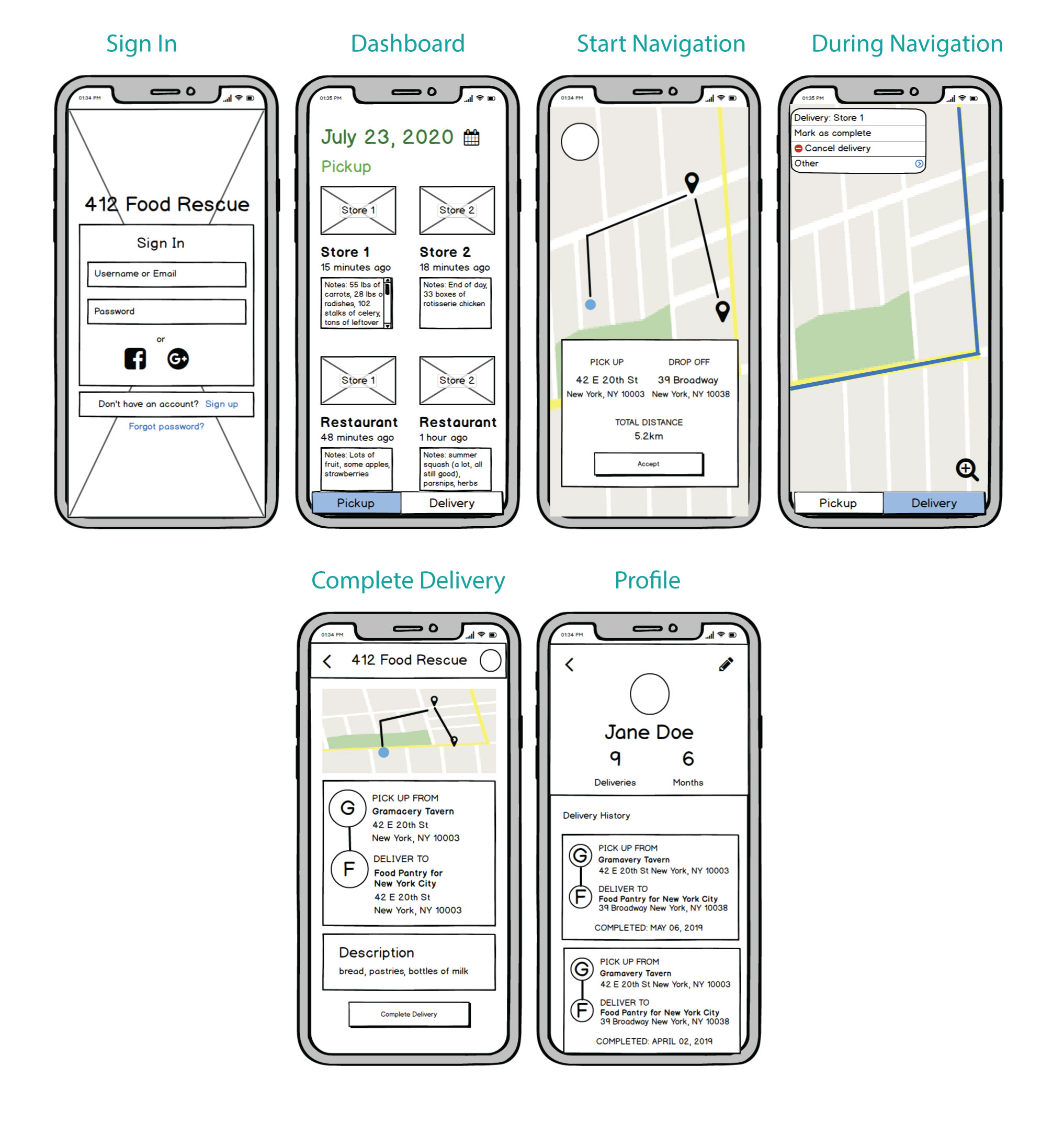
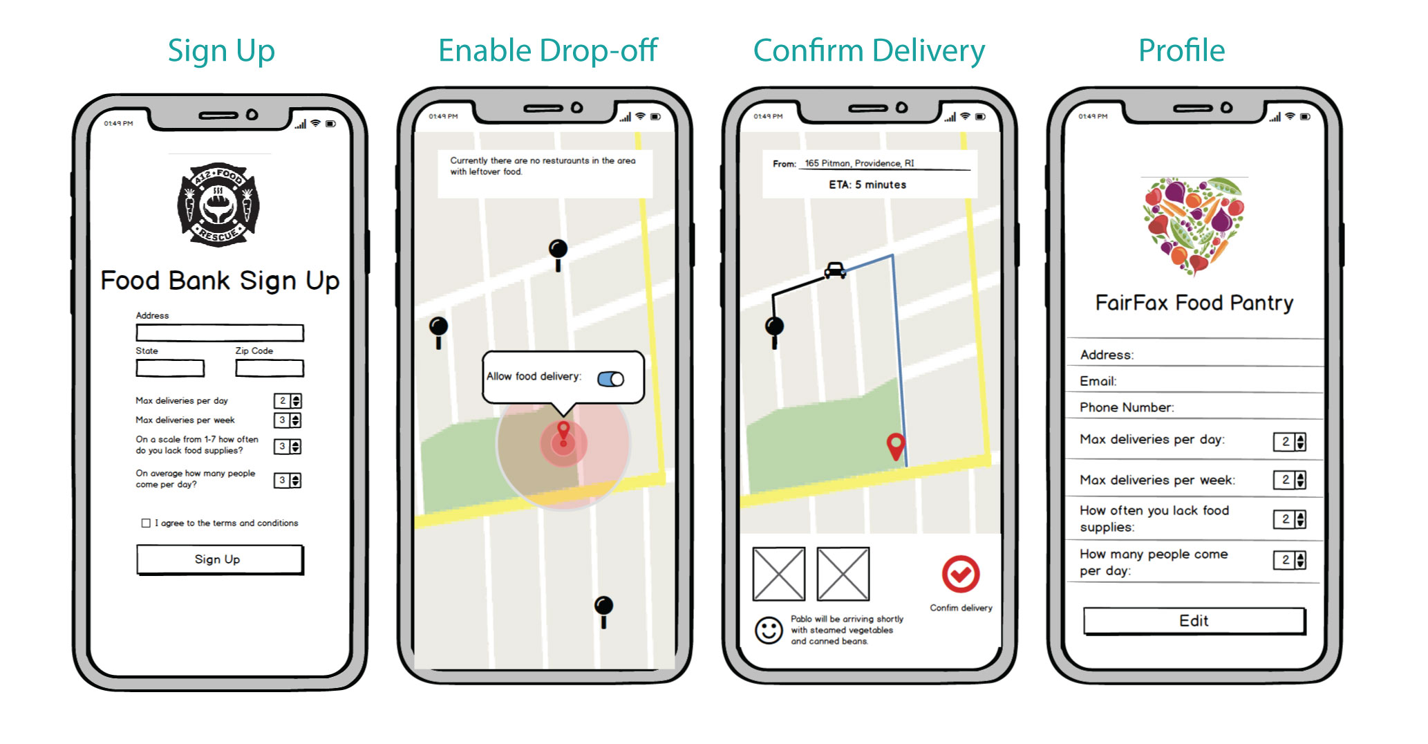
User Flow & Low-Fi Wireframes
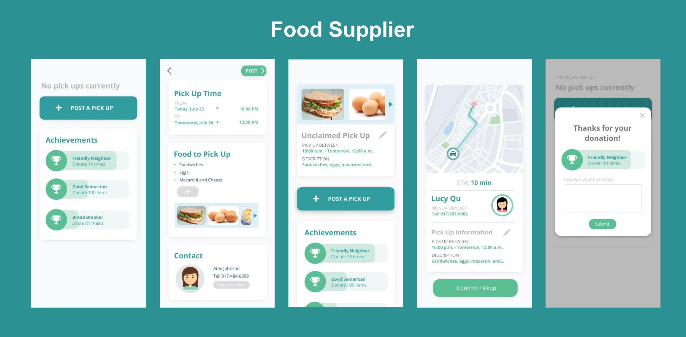
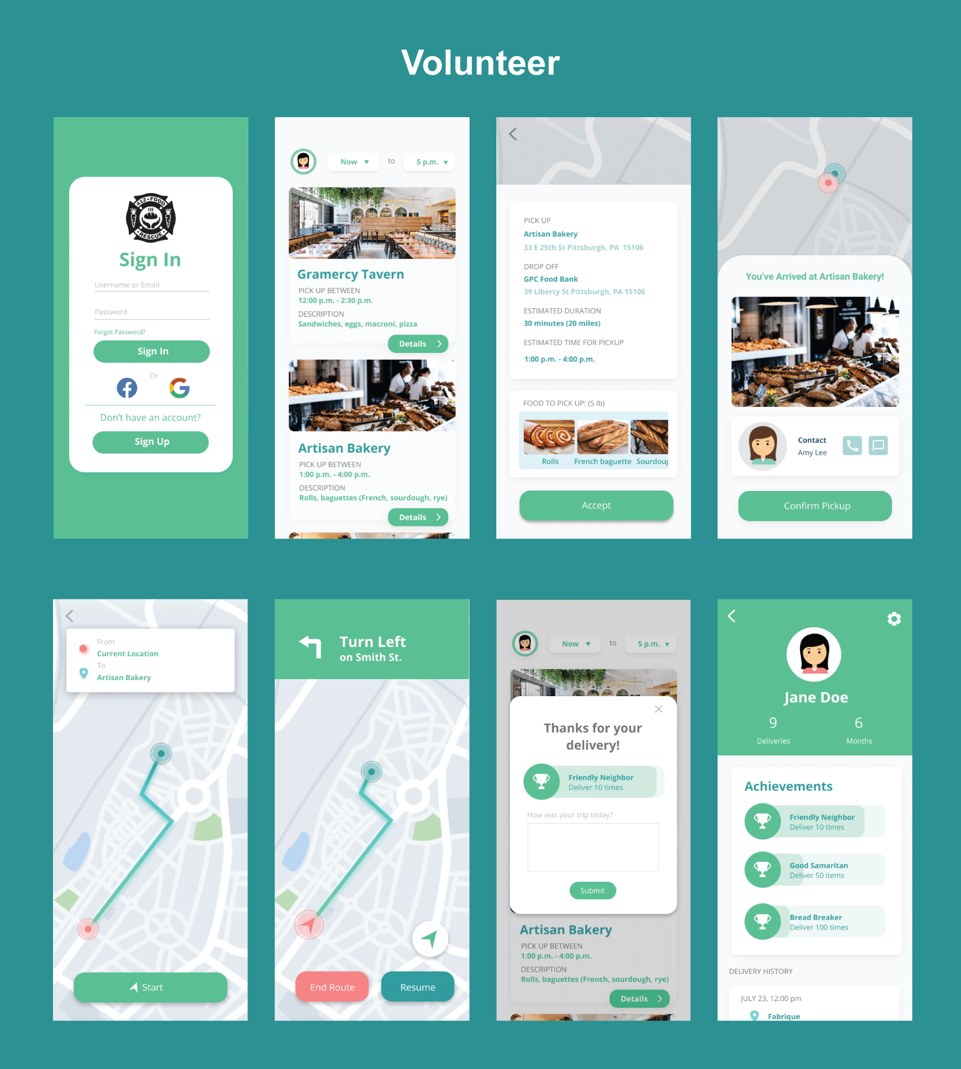
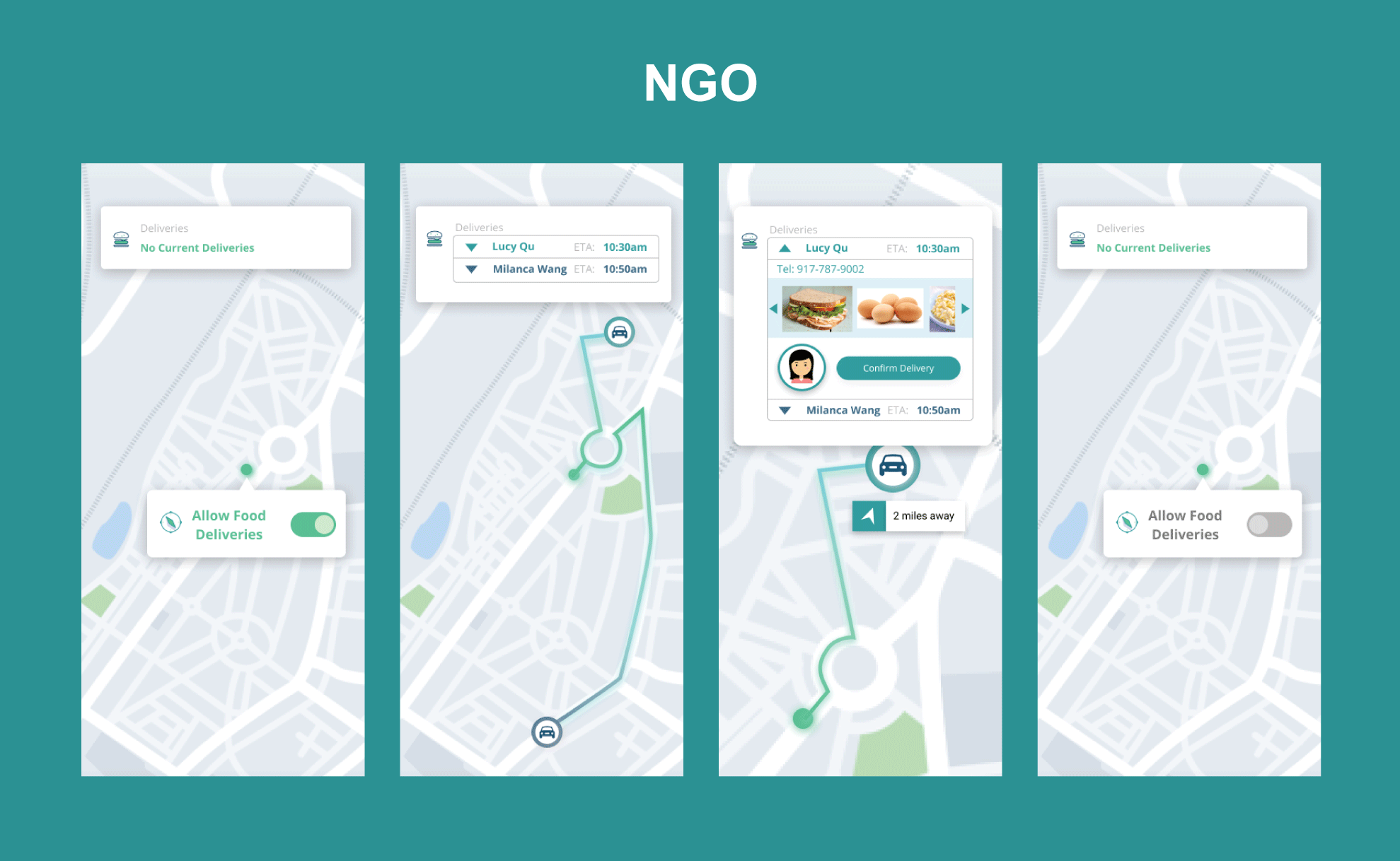
We identified three distinct user types, each with a different flow through the app:
High-Fidelity Prototypes
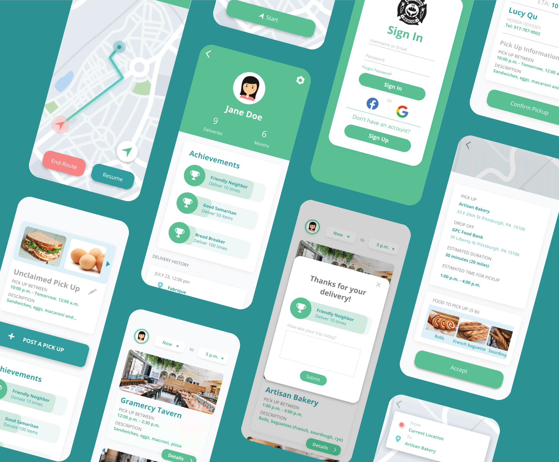
Improvements from low-fi to hi-fi included:
- Added a consistent color palette (warm greens/oranges reflecting food & community)
- Introduced bottom navigation for easier thumb reach
- Added map integration for delivery route visualization
- Incorporated progress indicators for food pickup status
Final Changes from In-class Critique
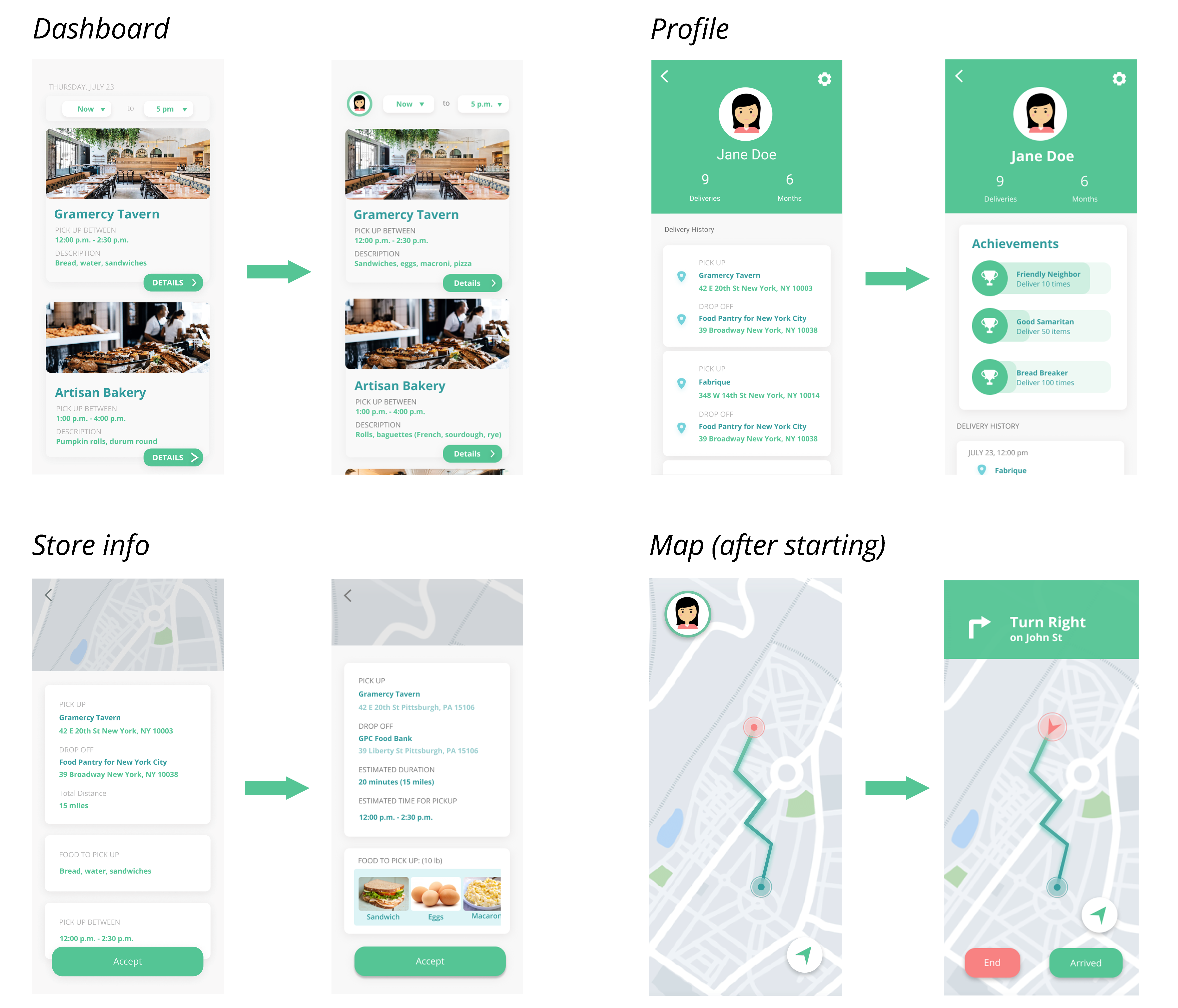
- Darkened body text for better contrast and readability
- Added estimated drive duration to delivery assignments
- Removed date from the main navigation (redundant with schedule view)
- Made contact buttons interactive with real tap targets
- Improved map screen layout to reduce cognitive load
- Added a congratulatory end screen after successful food delivery
Before & After
Final Visual Design
User Testing
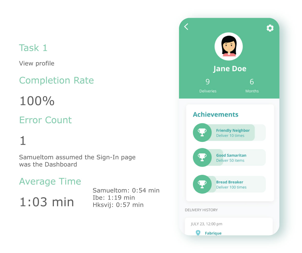
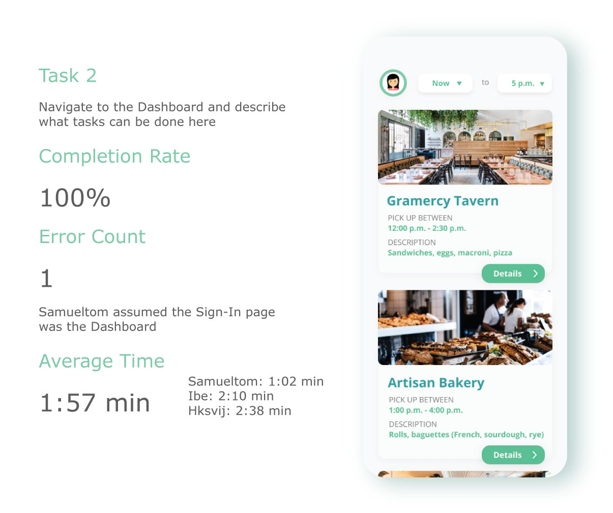
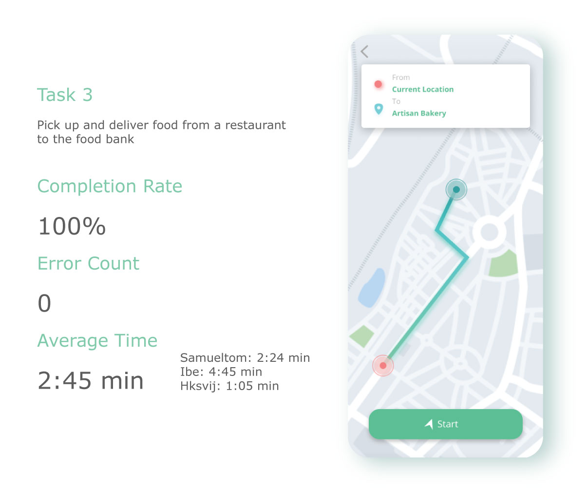
Hypothesis: Users can complete a food pickup assignment within 3 taps from the home screen.
Scenario:You are a volunteer for 412 Food Rescue. You've just received a notification about a nearby pickup. Navigate the app to accept the assignment and find the pickup location.
Quantitative Metrics
Qualitative Findings
- Users appreciated the clean, uncluttered layout but wanted more visible confirmation after actions
- Some confusion about the difference between "pending" and "active" assignments
- The map screen was praised for clarity; route alternatives were requested
- Users wanted push notifications integrated more visibly into the app flow
Conclusion
This project taught us the value of iterative refinement — each round of feedback meaningfully improved usability and visual clarity. The final designs addressed the core needs of all three user types while maintaining a cohesive visual identity. Future work would include implementing real-time route optimization and deeper NGO inventory management tools.