Book Depository Redesign
Role: UX Designer · Course: CSCI 1300, Brown University
Partner: Miranda Mo
Context
Redesign was a project for CSCI 1300: User Interfaces and User Experiences, a course at Brown University taught by Jeff Huang. My partner for this project was Miranda Mo.
Our goal was to choose a site or app and redesign it using some of the usability principles we had learned in class.
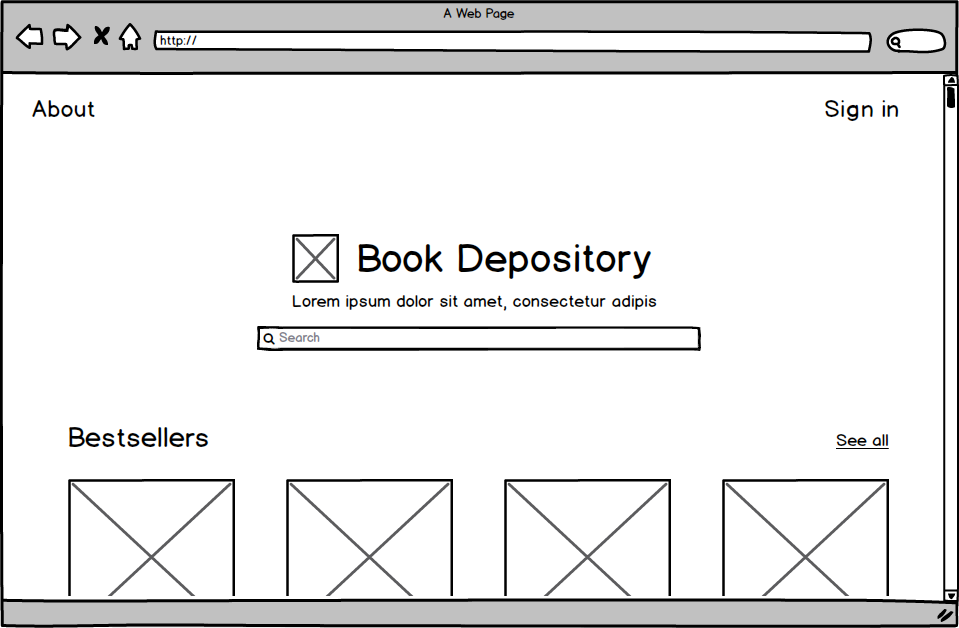
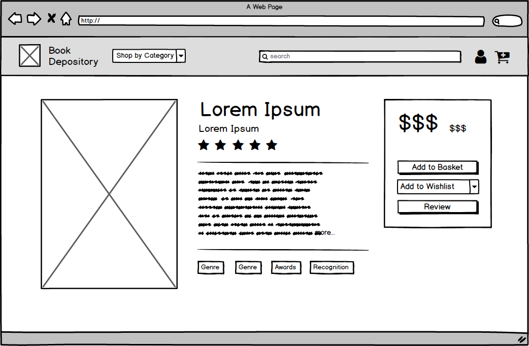
Wireframes
We chose to redesign Book Depository, a UK based book retailer that is known for free delivery worldwide. Integrating UX principles of learnability, usability, and memorability, we improved the user experience of the website to aid the site's intuitive navigation. We first analyzed the original website, prototyped low/high fidelity of a book information page, and then coded our responsive (4K widescreen desktop, laptop, tablet, and mobile) designs with HTML/CSS.
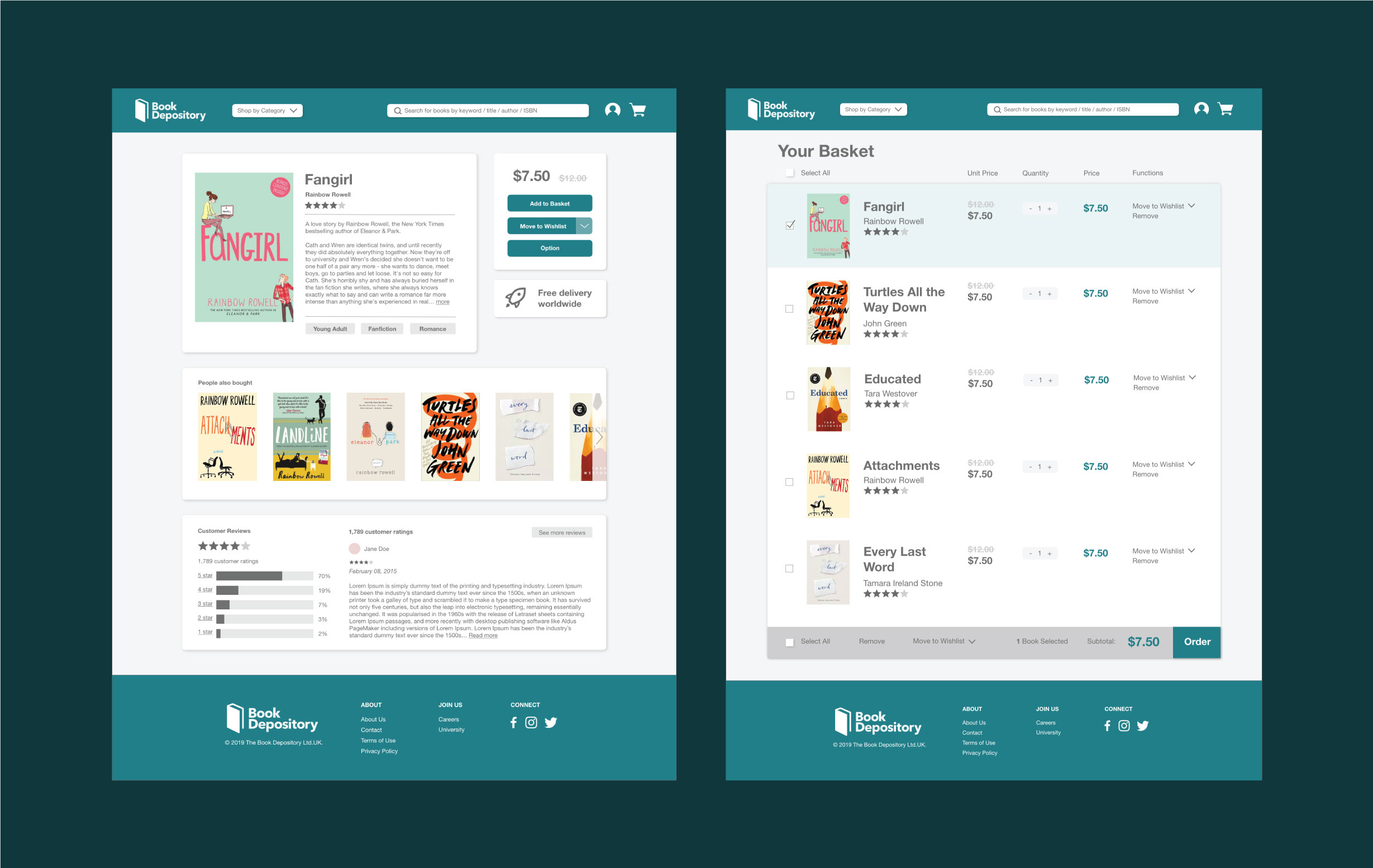
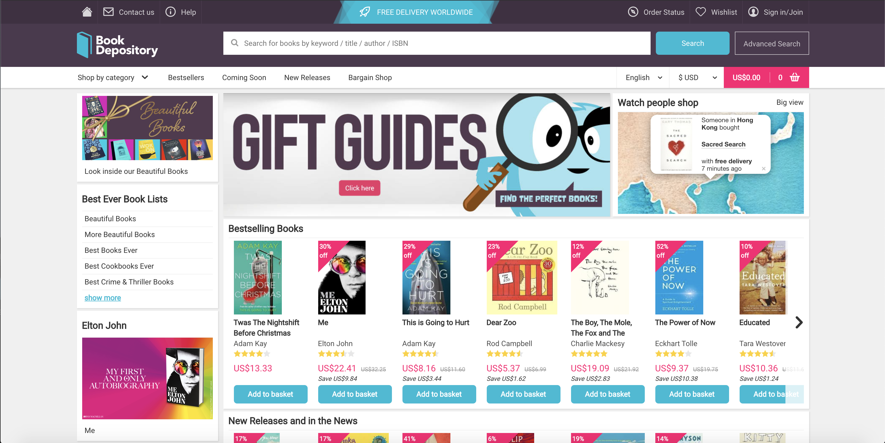
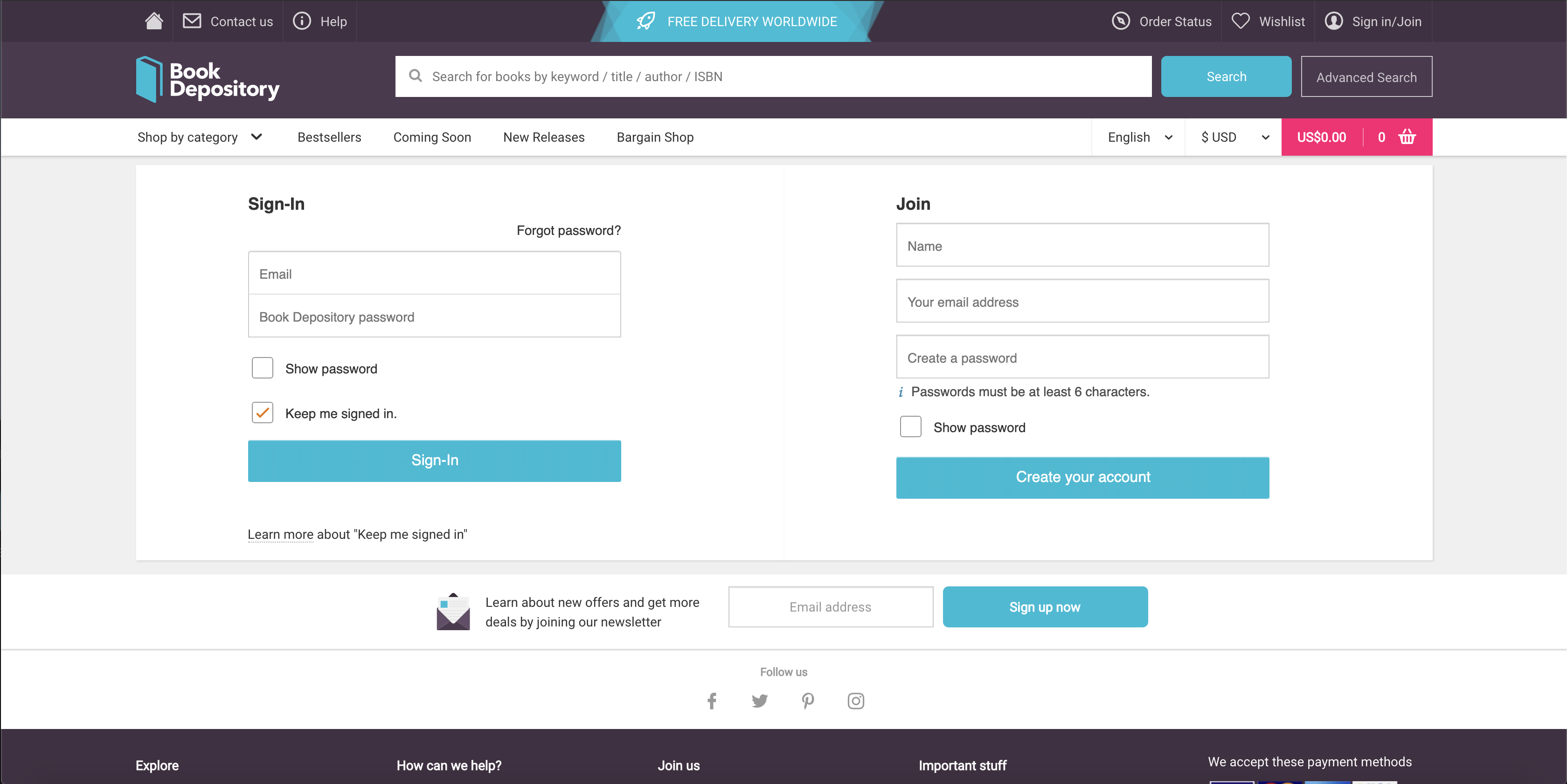
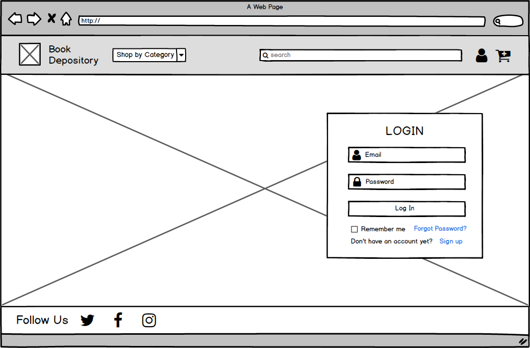
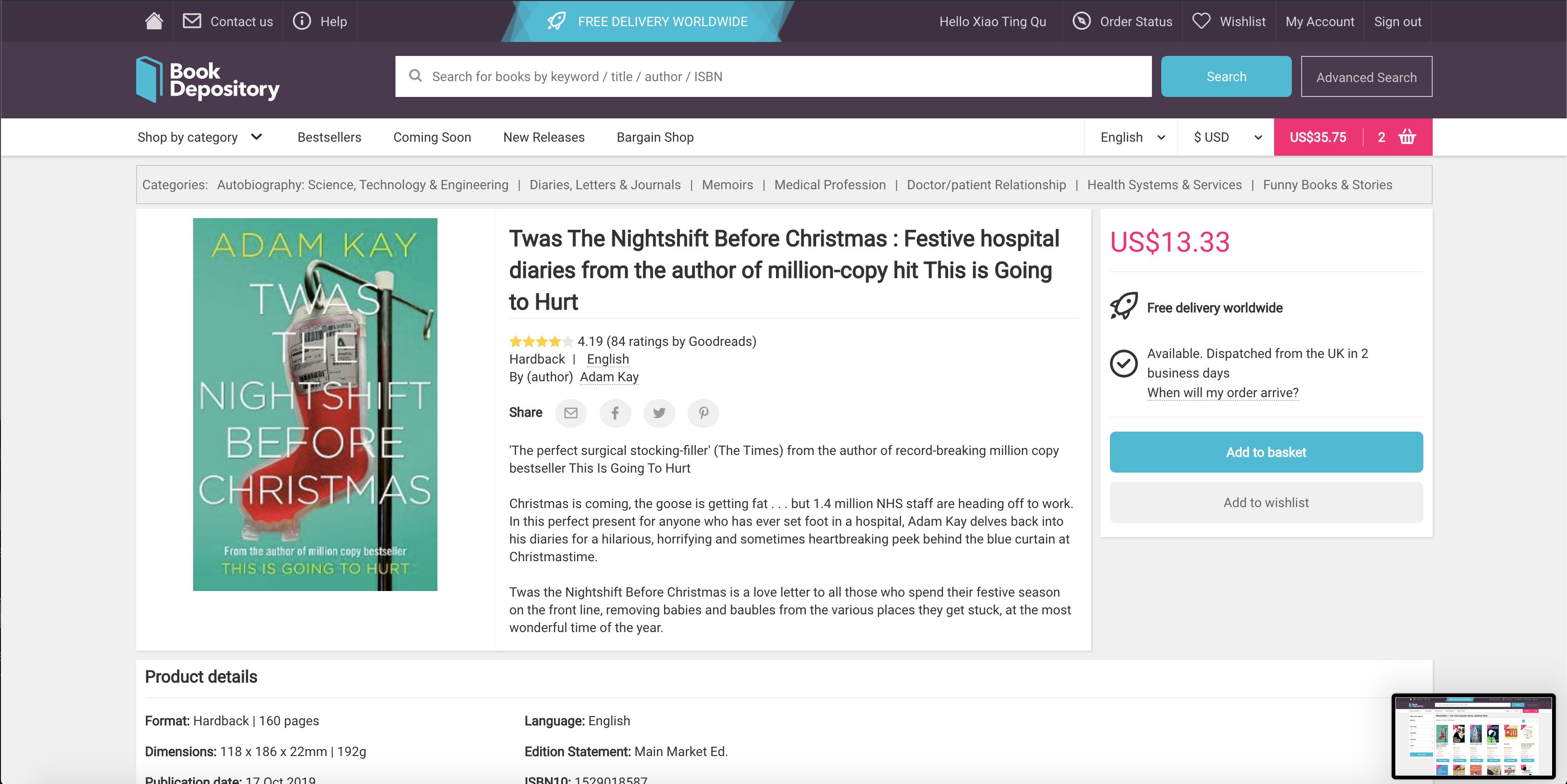
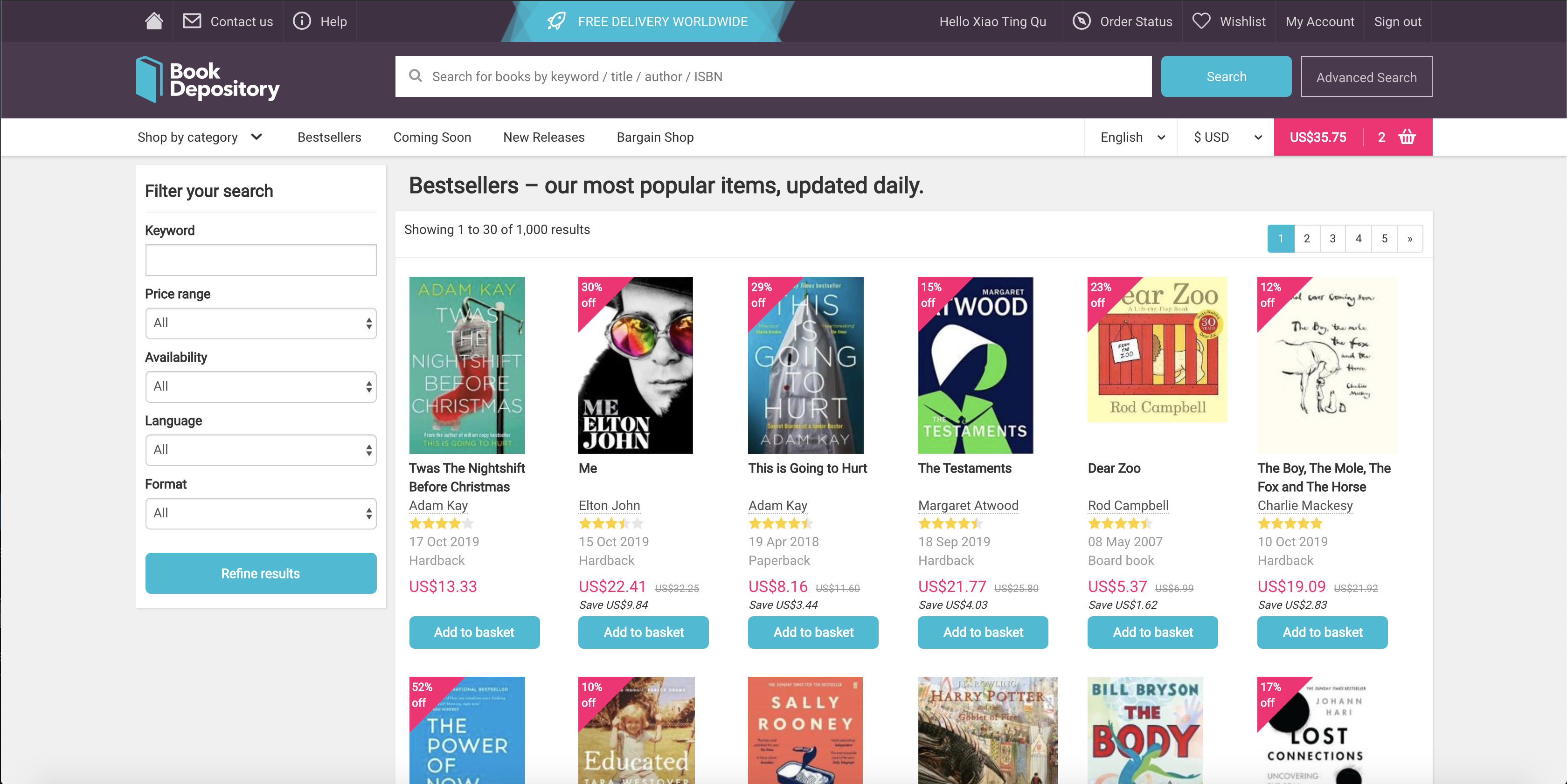
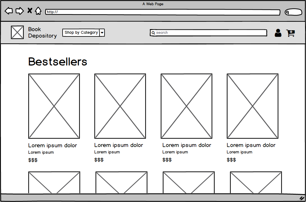
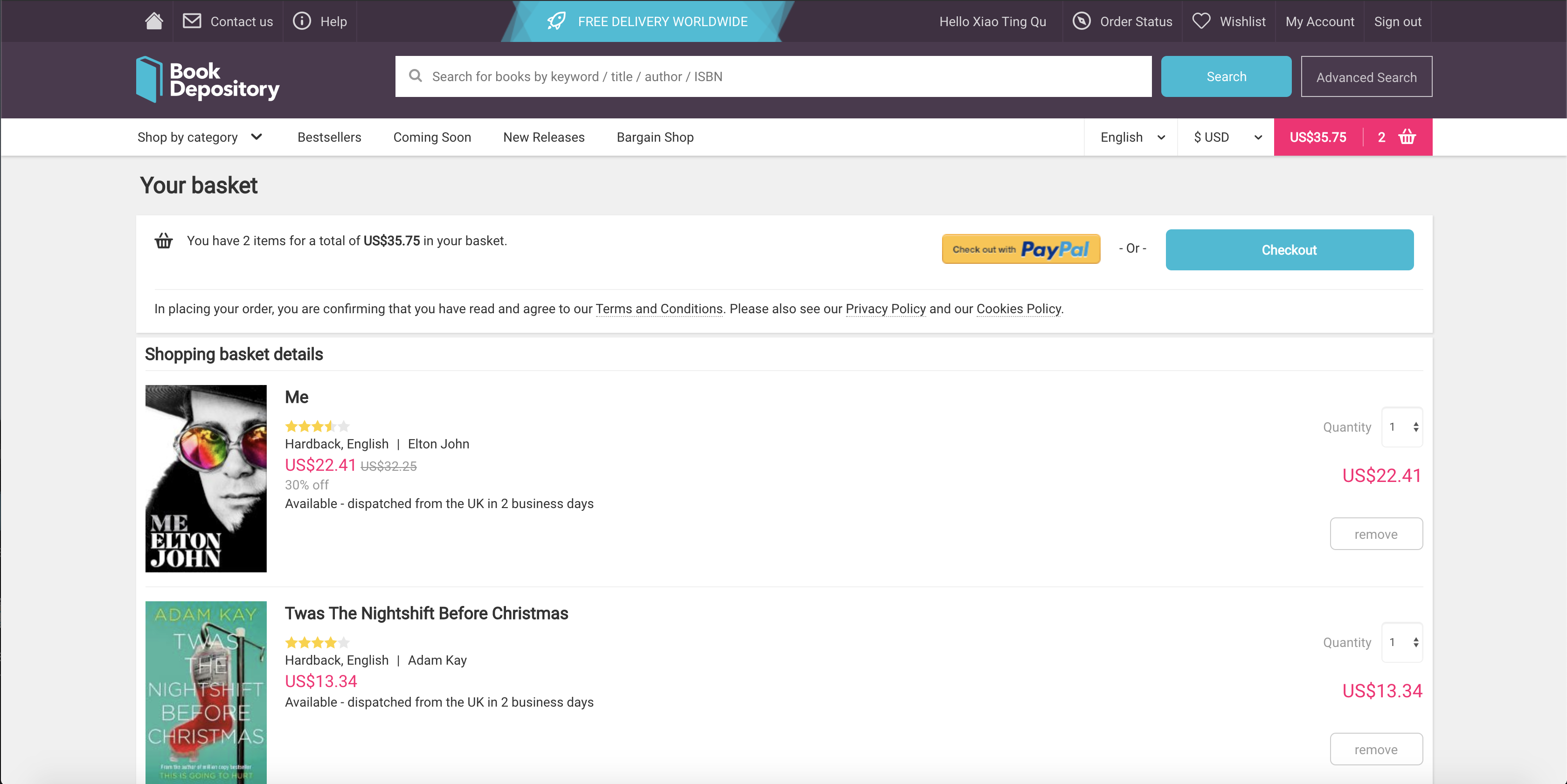
Below are images of the original home page, sign in, book information, bestsellers, and basket screen. We noticed the large amount of content, especially on the home page and in the navigation bar, and thought about how we could simplify the pages while keeping the main functionalities.
Home Page
Sign In
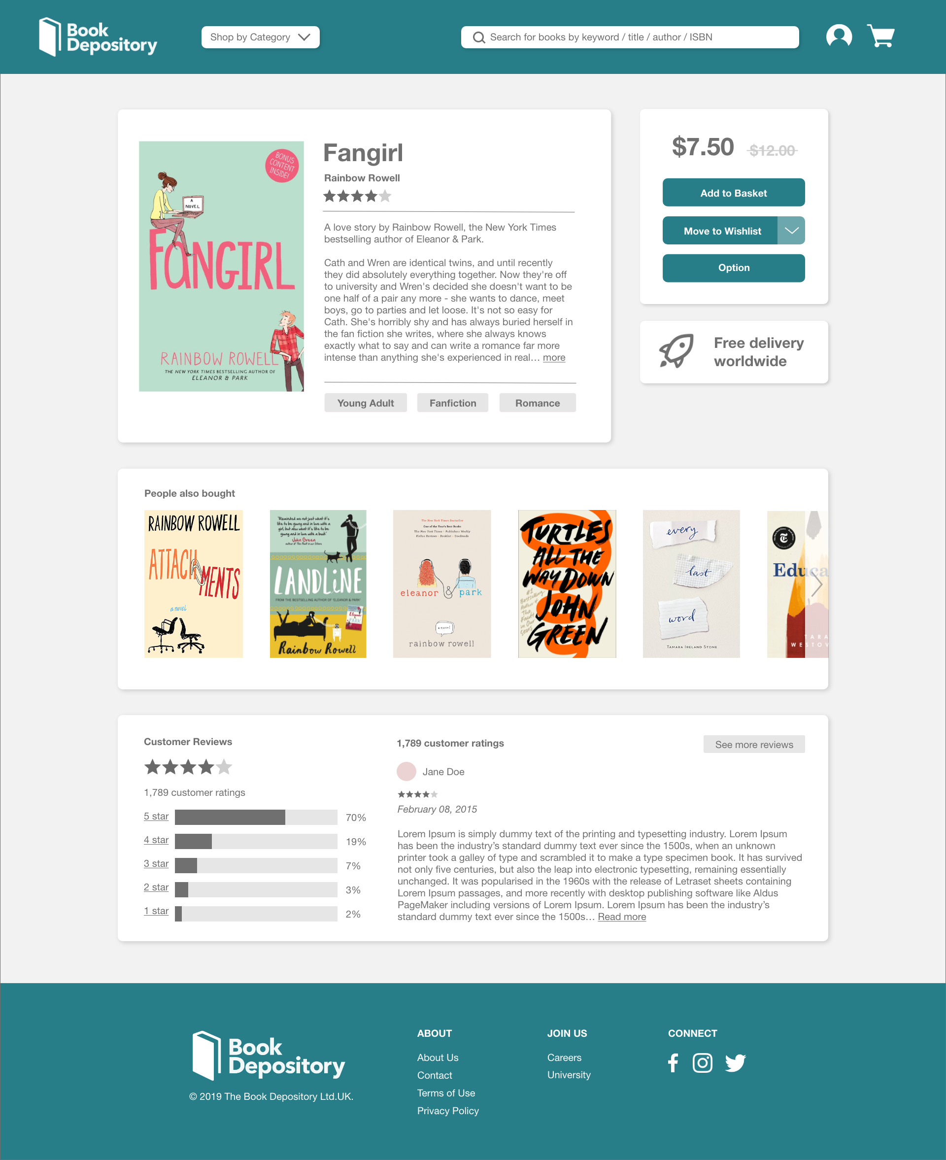
Book Information
Bestsellers
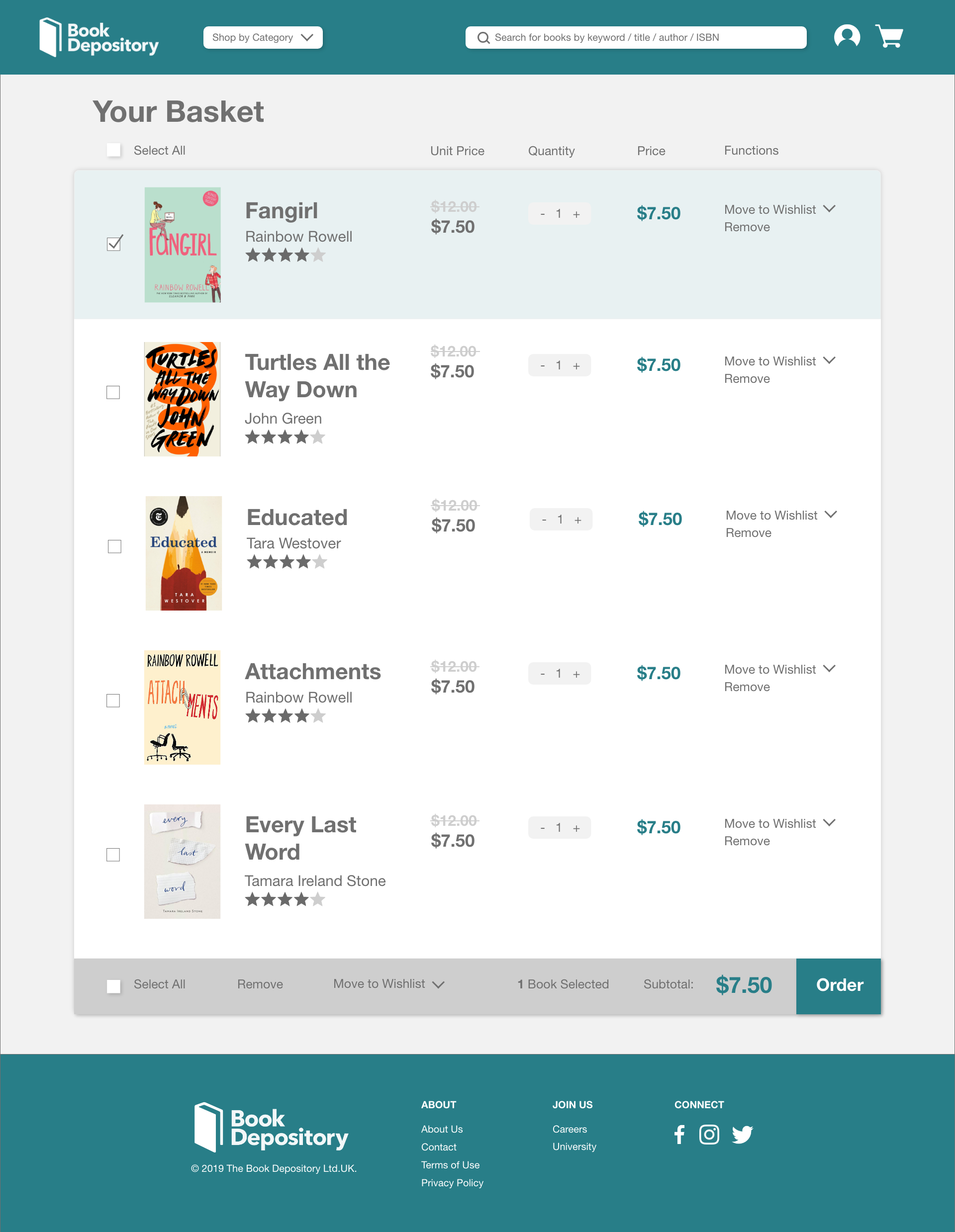
Cart
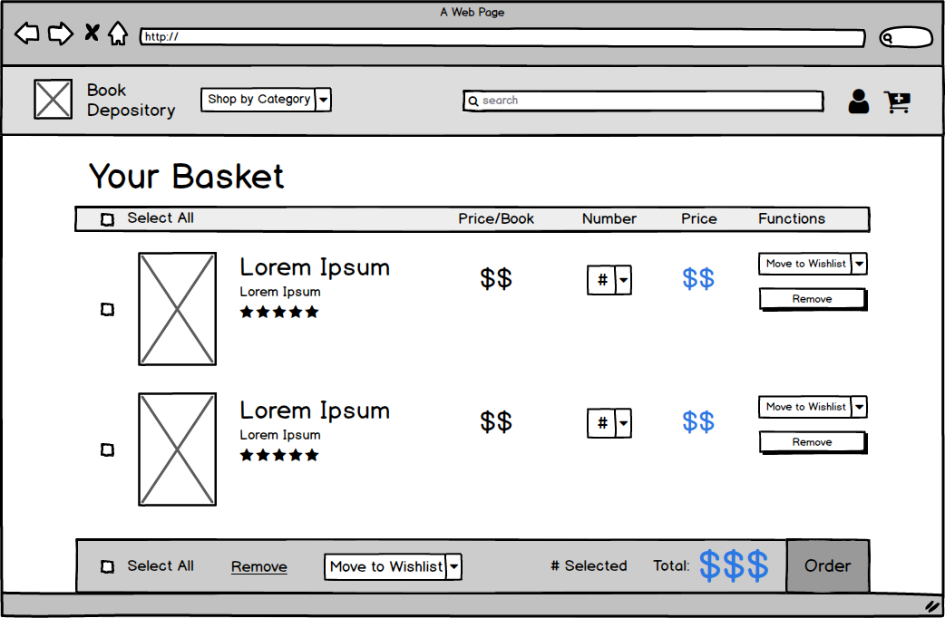
We created five wireframes, one for each screen (home page, sign in, book information, bestsellers, and shopping basket). The main changes include simplifying the navigation bar, increasing the size of the books, and reducing large amounts of white space that did not contribute to breathability. These changes decluttered distracting content and additional words to increase usability by helping users focus on the page's main functions.
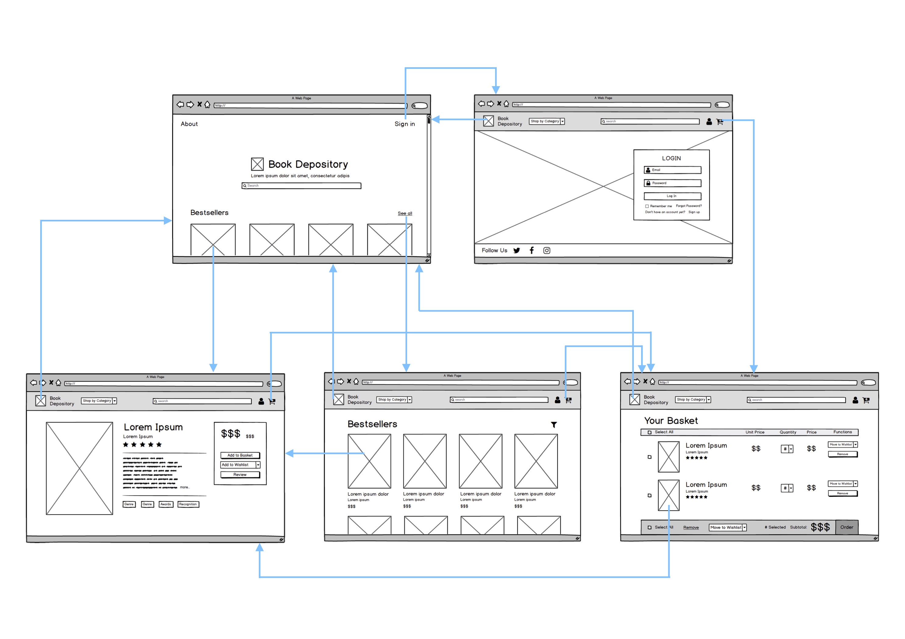
Navigation Flow
Next, we created a flow chart of the navigation flow between the five different pages that we chose.
UI Principles Comparison
| UI Principle | Original Interface | Redesigned Interface |
|---|---|---|
| Intuitive Design | Redundant features on the page in different areas, making it less intuitive what the difference is between all of them and which to click. Identifiable navigation bar, making navigation accessible on all pages, though it is a bit cluttered. | Eliminated components on the screen and placed them in different areas to create more minimal web pages. Simplified the navigation bar (e.g. putting wishlist and order status in profile page). |
| Ease of Learning | No option to move items in the basket to wishlist or to save for later, which is a feature that is incorporated in other popular sites (e.g. Amazon, Walmart, eBay), thus interfering with a new user's already established mental model of a shopping site. Amount of content on a single page can make learning more difficult. | Added “Move to wishlist” button in the basket page. Simplified design across the web pages, including just the essential features for the respective pages. |
| Ease of Use | The amount of content on the page is distracting and takes away from the focus, which should be the books. Does not allow batch action mode in basket page. Can only add book to wishlist after clicking into the book. | Enlarged display of books on the screen and increased font size relative to screen to draw focus. Added checkboxes in the basket page to perform actions on several items at once. Made it so that the “Add to basket” and “Add to Wishlist” button shows up on hover or on long-press when using a tablet or phone. |
| Memorability | Navigation bar and search bar create a site that is easy to use and colors draw eyes to certain areas, such as the “add to basket” button and the basket button. | Kept these features but created a much more simplified interface by grouping certain items together to make it more memorable (e.g. added “Shop by category” dropdown instead of listing multiple categories in the navigation bar and moving items related to user profile to be in the profile upon pressing the user icon). |
High-Fidelity Redesign
After creating our five wireframes, we made a high-fidelity mockup of the basket and book information screen.
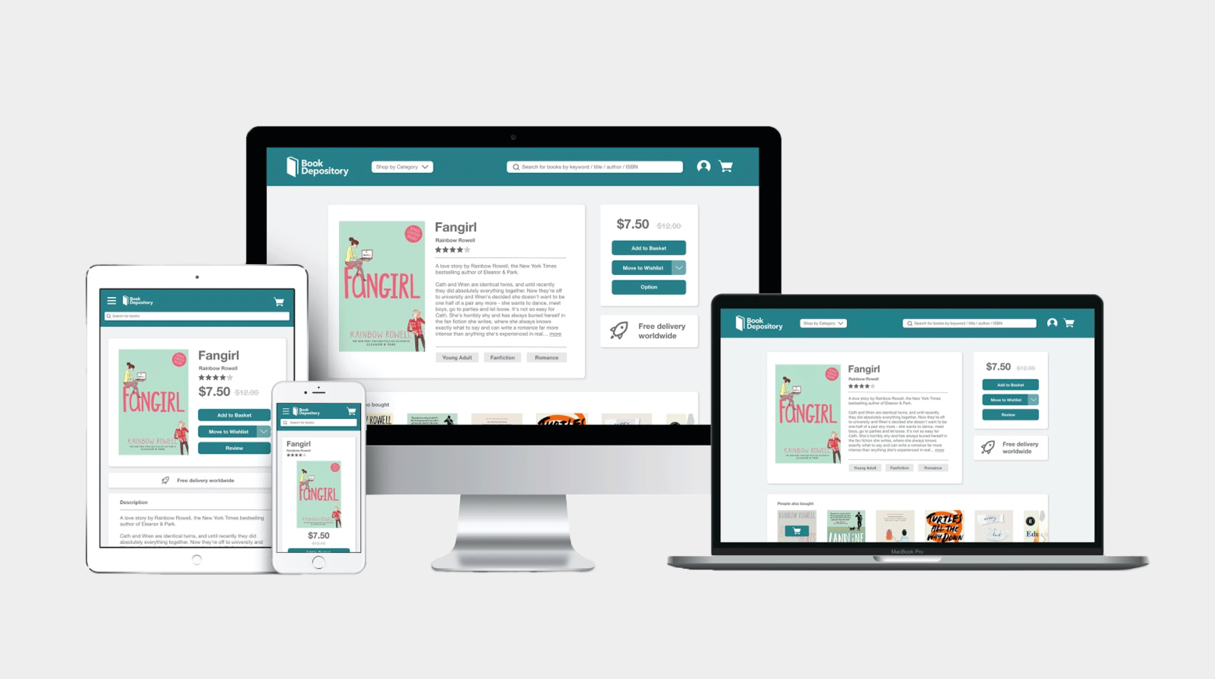
Responsive Redesign
The next step in the project was to create a responsive website that would maintain visual appeal across different screen sizes. First, we adapted the designs to four screen sizes: standard desktop (laptop), 4K, tablet, and mobile.
Then, we chose to code the book information page because content shifts to different locations on the desktop, mobile, and tablet screens. Below are annotated mockups of how elements on the screen respond to different screen sizes.
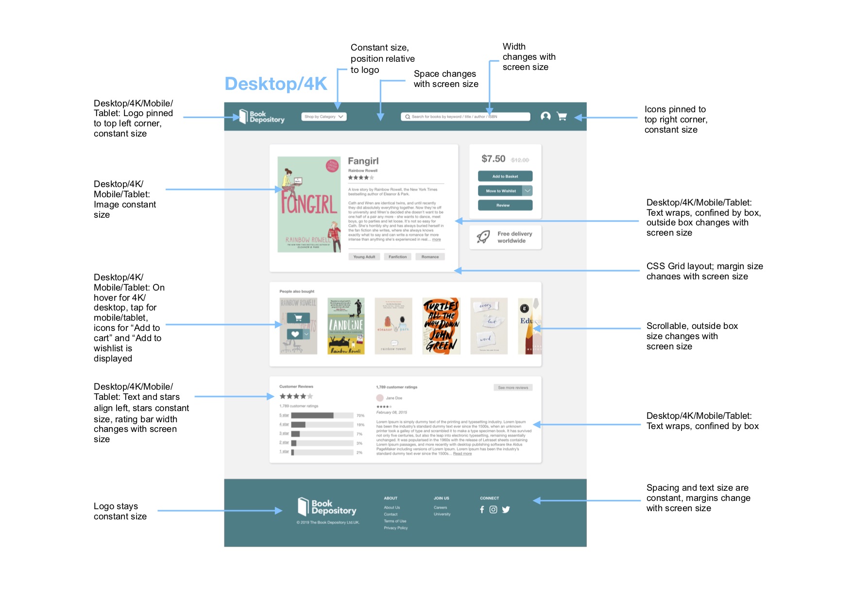
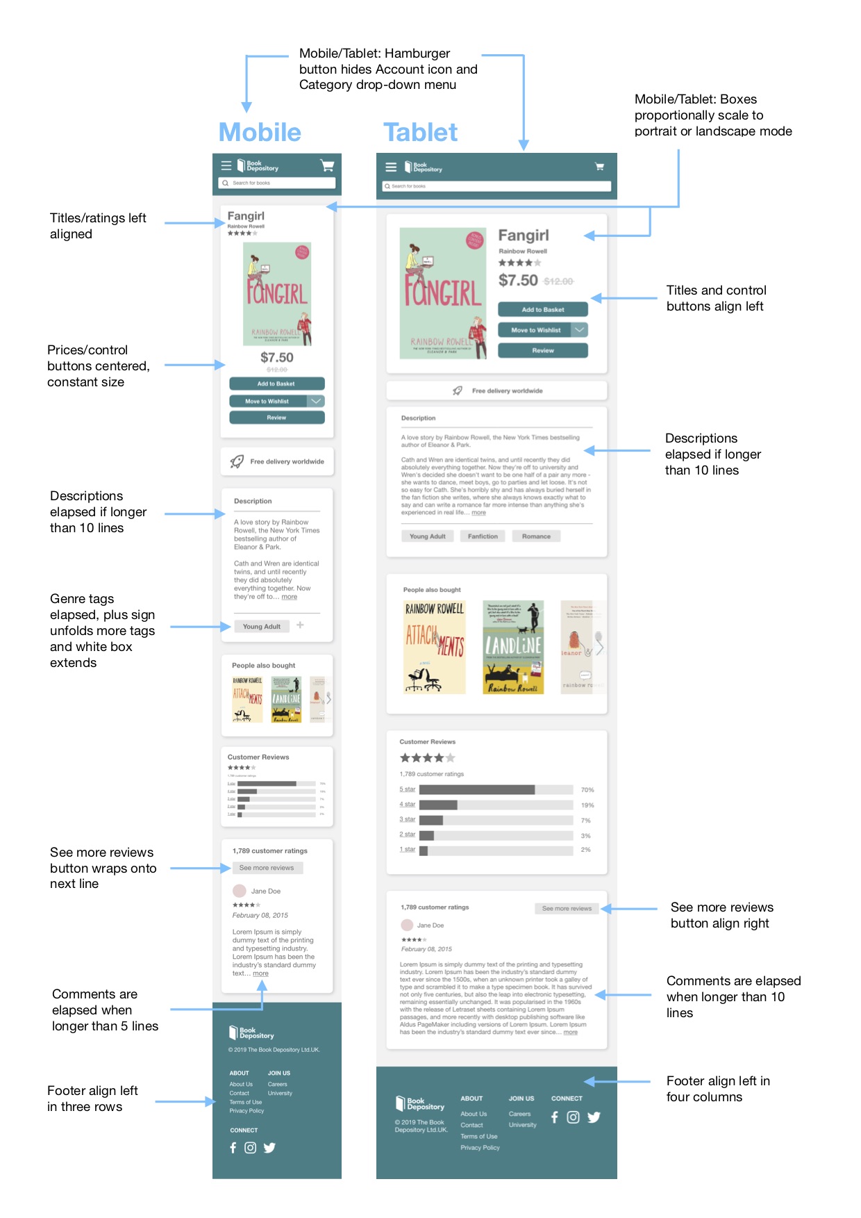
Design Choices
In creating a redesign, we first considered the most important features on the page and navigation from one page to another. Our redesign is a much more minimalistic version of the original site, but we made sure to include the important features on the page, such as the navigation bar, book cover, description, reviews, ratings, and footer. We simplified the navigation bar to only include the important aspects: logo, search bar, basket, profile, and “shop by category” drop down. Eliminating the additional components of the navigation bar that are in the original site still keeps the navigation flow intact while reducing the distractions from the additional words.
The original website for Book Depository has three main colors: dark purple, blue, and hot pink. In our redesign, we changed the color palette to have one accent color to make the site more minimalistic and to unify the content. We chose a dark turquoise for the navigation bar, buttons, and footer. This accent color draws attention to the important parts on the screen while not being too bright and distracting. It also connotes intellectual curiosity and professionalism, aiding the credibility of the website.
For font, we chose Helvetica Neue for readability and limited it to two font sizes (with the exception of the crossed out book price which is a third font) and used bolded words to highlight important phrases on the page. The original website uses a grid and has blocks around sections on the page to group important information together visually. We thought that these blocks were a good way to help with grouping content in a way that makes sense, so we included blocks in our redesign but increased the padding between the words and the border of the box to improve readability. We made the background of the web page a light gray color (similar to what is done in the original website) and in addition added a drop shadow to the boxes to further emphasize the distinction between various sections on the page.
Conclusion
Our goal was to redesign an interface using the usability criteria and design principles that we learned in class. We chose a site that has room for improvement. Through this process, we were able to go from ideation to creating low-fidelity and high-fidelity mockups to making a responsive website using HTML and CSS.